Tuesday, December 13, 2011

Photography Project 2: The Refridgerator

This project is more inspired by my own weird and random curiosity. I was wondering how often things in a refrigerator got moved around because it seems like I can never find anything. So in addition to photographing the dining room table I took a little detour to the fridge as well.

Monday, December 12, 2011

Photography Project: The kitchen table

Photography Project:

What is the dining room table? In the past, I would argue that it symbolized a place for people, particularly families, to come together, where neighbors sit when you invite them over, where delicious food lies when you're hungry.
Unfortunately, in more modern times I believe this is a false connotation. I have taken a picture of my very own dining room table several days in a row, trying to find evidence of people coming together.
There are five people (including myself) in the household yet do the photographs show anyone?


I came home to catch the evil feline on the table but he jumped off before I could catch the evidence on film.

Tuesday, November 29, 2011

What is Beauty?

Similar to one of the first questions we were asked, "What is Art?", beauty is something that cannot be defined by one simple definition. Different people choose to see different aspects as different things. I would like to say "beauty is in the eye of the beholder" but only because we were begged not to. In truth, its both very similar and very different to this.

In truth, beauty exists on different levels, many of which contradict each other. In example There is Physical beauty, emotional beauty, Inner beauty (people), there is beauty in a story or concept, and beauty in the way a well told lie or deception is thought out, and beauty in music.

Using these layers it is easy to imagine something that is both beautiful and hideous, like a painting with beautiful composition and painted perfectly but has a gruesome subject matter, or the reverse, a painting that, visually isn't as "pretty" But has a deep, beautiful meaning or emotional pull.

I personally, like the vain individual I am, find myself focusing most on physical beauty, how colors and shapes appeal to the eye and overall balance. I can appreciate beauty elsewhere but it is not what jumps out at me first.
That being said, I find beauty (particularly in art) in the intricate details and textures. I believe it is because of this that I tend to dislike bright colors more as it distracts my eyes from the intricacy that I so love.

Monday, November 28, 2011

Artist Presentation: Inka Essenhigh

Inka Essenhigh was born in Bellfonte Pennsylvania. She had attended both Columbus College of Art & Design and the School of Visual Arts in New York City.
Inka Essenhigh's chosen medium is oils paints, which she says, is because it has more variety and that she, personally, associates it with deeper emotions.
Born Again
2000
oil on canvas
90 x 78 inches

Essenhigh is attracted to "moody" and "muddy colors". She also says that she likes twilight. While she "might decide to paint daylight" She prefers a "moodier Palette"
White Rain
2001
oil on enamel on canvas
72 x 74 inches

optimistic horse and rider
2002
oil on panel
74 x 70 inches

getting comfy
2002
oil on panel
56 x 54 inches

Although I could not find much about her personally, while going through her website and gallery I noticed that her older work was mostly flat colors with the same distorted figures that her work features nowadays. It was not until 2002 that her paintings began to appear more three-demensional.

green wave
2002
oil on panel
60 x 72 inches

fantasy
2003
oil on linen
70 x 74 inches

chainlink fence
2004
oil on canvas
76 x 70 inches

The majority of Essenhigh's paintings are a narrative with a distorted, twisted figure taking part in a story which is usually drived from a particular "atmosphere of encounter", Perception, individual or scene.

brush with death
2004
oil on linen
60 x 48 inches

In Bed
2005
oil on canvas
68 x 62 inches

This is the painting that was featured in the text book that inspired me to choose Inka Essenhigh for my presentation. I loved how twisted and dream-like it was, especially with how the sprites are tugging at the sleeping woman.

Setting Sun
2005
oil on canvas
75 1/2 x 70 inches

Subway
2005
oil on canvas
78 x 70 inches

Exhibited at the Saatchi Gallery. "Subway" Depicts subway commuters at rush hour bustling to their lives leaving behind fluid trails of themselves.

Dance Party
2006
oil on linen
46 x 42 inches

Fall (Red)
2007
oil on canvas

Global Warming Cloud
2008
oil on canvas
78 x 60 inches

Spring Bar Scene
2008
oil on canvas
78 x 72 inches

Sleeping Faun
2010

Tuesday, November 1, 2011

Chapter Twenty-Two: Artist Contrast 2

The gold color and various shapes found in Louise Nevelson’s “Royal Tide II” are phenomenal. What is more amazing is how Nevelson could take ordinary materials and objects and in turn create a piece that fits so well together that those objects become unrecognizable unless looked and studied closely. Furthermore the choice to paint the whole thing gold was a wise choice as it further meshes the sculpture together and creates a sort of unity amongst the otherwise odd and abstract shapes. This makes the sculpture look rich, coherent, and elegant.

In contrast to this, Renzo Piano and Richard Rogers building The Georges Pompidou National Center of Art and Culture in Paris, is multiple colors. Its bright, vibrant, and young despite being built in 1977. Very much like Nevelson’s Sculpture, there’s a lot of details that mesh together beneath the glow of the bright lights. The scaffolding on the outside reminds me of the borders around Nevelson’s sculpture. What I enjoy most about this building though is the pathway leading up to the multiple stories of the building. It looks like it would be incredibly fun to walk through much as “Royal Tide II” looks like it’d be incredibly fun to see and touch to attempt to identify everything put into it.

As far as differences go, the two have many. First there’s the obvious fact that one is a wall-like sculpture while the other is a large-scale building. One is monochromatic in a rich gold while the Pompidou National Center of Art and Culture is bright with a multitude of colors, lights, lines, an windows. If I had to describe each, I would say that Louise Nevelson’s “Royal Tide II” is a contrast between abstract but still, to me, has an old fashioned feel. However Renzo Piano’s and Richard Rogers’ building is bold, new, and futuristic.

Chapter Twenty-Two: Artist Contrast 1

Alice Neel was a painter that did not what people expected but rather what she wanted. On page 510, Neel defines herself not as a “portrait painter” But as a “people painter.” I agree with this statement. The term “portrait” sounds stiff, perfect, and posed. Alice Neel’s paintings are anything but these. They are loose, expressive, and allows you to see not a perfect rendering of the persons literal appearance but a glimpse into their minds, emotions, and expressions.

As already stated, Neel’s paintings are expressive. They She seems to focus on feelings, personalities, and individuals as opposed to painting a mere physical shell of a person. It is just as Neel says. She paints “people” not just bodies, not just portraits.

The particular painting of hers that caught my attention is “Harley” that she had completed in 1965. What I enjoy most about this painting is the pose. It is something I have seen many times in life; When someone is upset, fed-up, lost, or stuck and do not know how to proceed. It is a feeling that Neel has captured phenomenally.

In comparison to this, I found that Jenny Saville’s painting “Rosetta” on page 515 which made me think of as pure expression. The blank blue eyes, the facial expression, even the style in which she painted it all. It all builds up a feeling of being lost or despair.

In addition to their use of emotion and expression, both paintings are similar in style. In both the strokes of paint are visible. They are not meticulously blended as in photorealism and because of this I believe the paintings become even more powerful than they would have been had the artist chosen to perfectly render them.

Tuesday, October 25, 2011

Chapter Eight: Artist Contrast 2

Compared to the last two artists, Ed Ruscha’s Standard Station is neither a wood cut or an engraving. it’s a screen print and as far as stylization goes it is very stylized. The simplicity of this image is beautiful. There are so few colors used yet they are used in such a way that the image itself stands out. The red Gasoline pumps which would not stand out against the sky, stand out starkly against the beige of the station. This also holds true with the “Standard” Sign, which would be missed amongst the intense orange yet seems so bright in comparison to the blue sky in which it sits.

In Comparison to Standard Station, March Chagall’s Solomon from the Bible is very different. Not only is it a lithograph instead of a screenprint but the images are made up of distinct black lines, whereas Ed Ruscha’s screen print had no lines around his chosen colors. Solomon from the Bible Also lacks that crisp transitioning between colors. Colors don’t end, instead they bleed and blend together to color the piece and without the black outlines it would be difficult to depict the image at all. However, much like Ed Ruscha’s, Chagall’s lithograph is very simple. Both pieces, regardless of colors, are flat, and the lines used in Solomon from the Bible Are used minimally and very simply very much as the colors in Standard Station were used very minimally and simply.

Although it is difficult to say which one is in essence “better” in my mind due to both pieces being so different, I will say that I much prefer the clean-cut simplicity of Ed Ruscha’s colors over the muddled hues in Marc Chagall’s work. I can see how this kind of image would be mark able and easily reproducible and overall “Likable”.

Chapter Eight: Artist Contrast 1

Albrecht Durer’s Four Horsemen of the Apocalypse is a beautiful woodcut and while Durer is given credit for the drawing it is possible that he did not carve the tedious hatching lines himself. This print is phenomenal because of its intricacies. Considering it had to be carved into wood the detail is phenomenal and the scene, albeit a bit gruesome, is mythical as well particularly with the angel swooping amongst the clouds. Ironically, while the angel is swooping down from the top of the print, there are people being trampled underfoot at the bottom of the print and a beast with its mouth wide open, swallowing them.

Contrasting to Four Horsemen of the Apocalypse is Raphael’s drawing The Judgment of Paris, engraved by Marcantonio Raimondi. This drawing is taken from mythology more so than Four Horseman of the Apocalypse yet it lacks the gruesome death of humanity. There is no disease in the drawing. In fact, the scene depicted does not even have the mortality of humans in it. Instead it is filled with the beautiful images of greek gods and goddesses. Coincidentally the “angel” in this drawing is in the upper center portion of the piece as well, only slightly lower than where Durer's angel is depicted. Only there are no horses following him. In fact in this drawing the horsemen are heading in the opposite direction and not gruesomely trampling humans underfoot which is always a plus.

Despite this, I prefer Durer’s woodcut. Raphael’s and Raimondi’s engraving is more ascetically pleasing and “beautiful” but every time I glance back at Four Horsemen of the Apocalypse I notice something new, something different that I had not seen the last time and it draws me in all over again whereas in The Judgement of Paris, my mind basically just sees a gathering of beautiful people. It just does not have the same illustrative quality.

Lecture Analysis: Identity

Identity is one of those things that vary from person to person. No one has the same sense of identity nor does anyone have the same level of identity. Most importantly though, not all people are happy with the identity that they are seemingly stuck with.

Second Identities, are not necessarily a reflection of ourselves (although they could be) but a reflection of who an individual would like to be. This is taken to an extreme in Avatar where wheel-chair bound Jake Sully is given an Avatar body to pilot and control where he can walk, run, jump. Not all second identities are as immersive as Jake’s though. Some can exist as a mere virtual character online, as we also learned. This character can be anyone, thick, thin, redhead blond, It does not even have to be human. The physical attributes can be the exact same as the person playing the character yet the personality can be different.

After all, compared to physical appearance it can sometimes be more difficult to change one’s personality as we often times act differently around different people thus distinguishing, in a sense, multiple identities. With friends, a person could be fun-loving, lazy, and loud, however when dealing with their boss that same person can become a quiet, dutiful hard worker, and then transform into the golden child or better yet, the rule breaker, when surrounded by family.

Overall I enjoyed the lecture. Not only did I get to watch Avatar in class (Huzzah!), but it left me with more thoughts in my head then when I entered a classroom which, to me, is very important.

Tuesday, October 18, 2011

Chapter Seven: Artist Contrast 1

Zhang Daqian’s “Mountains clearing After Rain” Is a beautiful scroll done with ink and color on paper. It looks very much like water color. The majority of the piece is composed of cool hues or greens and smoky blues to be more specific. The images are vague and the colors bleed together beautifully with pigments of reds and orange intermingling with the blues and greens. There appears to be a buildings on a portion of the mountains and more buildings far below. At the bottom right hand corner foliage and trees.

In Comparison to this beautiful by Daqian, Pablo Picasso’s “Guitar and Wine Glass” is vague in a completely different sort of way and that way is meaning. The image itself, a collage and charcoal, is crisp an clean. It is composed of eight distinguishable items that are easy enough to point to tell where one begins and one ends unlike “Mountains Clearing After Rain” Where the colors blend and bleed with each other to create one indistinguishable object.
Picasso‘s choice and use of the colors in this collage is also very different as well. Instead of focusing on a cool color palette, Picasso uses primarily shades of browns in this piece with the exception of the blue rectangle shape in the very middle, the black half-moon at the bottom, and the white circle hovering just above it.

As stated previously, the primary similarity in the two paintings is that they both are very vague. It is unlikely that the true image that each painting depicts would be envisioned and coherent if not for the Artists’ helpful titles which clearly suggests what should be seen within the artwork.

Unfortunately in Picasso‘s case, even the title “Guitar and Wine Glass” Does not make the collage hint at a guitar and wine glass. However, this is not the case with Zhang Daqian’s wall scroll. After reading the title it is easy enough to make out the mountains clearing after a draught of bad weather, the lines that make up what could be buildings, and the rainy clouds off in a difference. In addition to this the choice of colors definitely gives it a “rainy day” sort of appeal and feeling.

Chapter Seven: Artist Contrast 1

In chapter seven the two paintings “young woman with a Gold Pectoral” From Fayun in 100-150 C.E. and “The School of Athens” painted by Raphael in 1510-11 caught my eye.

First off, “Young Woman with a Gold Pectoral” is an encaustic painting and is part of the reason why this painting is so interesting. This medium involves wax that is melted, mixed with pigment, and then painted, creating layers of varying thickness upon the painting surface. The textbooks likens it to wax candle drippings. Then, heat is applied swept over the final painting to further ensure the different hues blending. This Technique works well in “Young Woman with a Gold Pectoral” The colors are beautiful more natural and earthy tones as opposed to the flashy colors often seen nowadays. The subjects eyes are huge and dark, very much like the saying “mirrors to the soul”. This is part of the reason it caught my attention despite being what appears to be a simple portrait.

Although the color choice in Raphael’s “the School of Athens” are very similar to “Young Woman with a Gold Pectoral” with earthy tones of browns and beiges, the painting itself is very different.
Rather than being an encaustic painting, it is a Fresco, a painting done on still-damp plaster and whereas most mediums are still changeable after being put down, Fresco’s are permanent.
This particular beautiful mural features an entire group of people instead of just a simple portrait and focuses primarily on the depiction of the Greek Philosophers Plato and Aristotle .

Whereas “Young Woman with a Gold Pectoral” Her eyes could be mirrors into her soul, I think Raphael’s mural presents a different kind of mirror: a mirror into the mind. This is only strengthened by the appearance of the two well known philosophers.

Overall Both paintings are beautiful and stunning. The simplicity and textural quality of “Young Woman with a Gold Pectoral” grants the painting a unique quality and despite being anything but simple, Raphael’s stunning mural is not to be out done as it opens up into the great city of Athens.

Chapter Six: Artist Contrast 2

Late.

Chapter Six: Artist Contrast 1

Chapter six discusses drawing and the various drawing surfaces and mediums. Because most drawings are studies and non-serious work, this chapter offers an entirely different selection of artwork to pick from.

Drawings are wonderful because they often times are studies and can show how an artist begins the process of a thought or concept which is still identifiable in the finished product. A good example of this is Filippino Lippi’s “Figure studies: standing nude and seated man reading”. This particular drawing is done in metal point on pale pink paper. As titled, it is a study of the human figure and is realistically rendered with the metal point.

In contrast to this “Prince Among Thieves with Flowers” By Chris Ofili, is completed in Graphite rather than a study of figure, Ofili uses the pencils to draw attention to the portrait made up of small afro-haired heads. In the background he used harder pencils to create the lighter, sharper image of the flowers.

Ofili uses a newer technique and the resulting image is certainly cleaner and more modern. This is not just because of his choice of medium but also how he stylized the drawing.
Unlike Filippino Lippi’s figure study, where you might be able to identify a portion of the image without seeing the rest, in “Prince among Thieves with Flowers” if a small portion of the drawing was separated from the rest it is doubtful that the portion will remain recognizable and hint at the full image.
Also some-what coinciding with this is the fact that Lippi’s figure study is created to appear three-dimensional whereas Ofili’s drawing is flat and without the transitional use of value.

Monday, October 17, 2011

Lecture Analysis: Blind Contour Drawing

This evening we discussed drawing and how our brain often times interferes and makes the process of drawing infinitely harder by skewing what we truly see into what we think we see or how I brain processes what we see.

To get around this the whole class participated in a Blind Contour Drawing. This is a type of drawing done without looking at the paper. It is supposed to be completed without lifting your pencil from the paper or lifting it only the smallest amount of times possible.

Despite my dislike of this particular exercise, it is a useful thing to do. Much like a warm up before a work out, it can help ease the mind and sometimes can take a person to a complete other world. unfortunately, despite the benefits, most contour drawings do not exactly turn out pretty.

Chapter Five: Artist Contrast 2

Also found in chapter five, Principles of Design, are the two paintings “the three ages of woman and Death” painted by Hans Baldung Grien, and “Venus with a Mirror” by Titian.
Both paintings were completed at the same relative time, about fifty years apart. Both paintings also depict a woman admiring her reflection in a mirror. However, in “Three ages of woman and death” the woman is holding a small hand mirror and in “venus with a Mirror” it is a cherub holding the mirror in which the Goddess Venus admires herself in. Coincidentally there is also the form of a child in Hans Baldung Grien’s painting, only rather than a cherub it is the woman’s younger self playing amidst the scarf tied around her hair.

While both paintings are very similar their major difference is ironic. In “The three ages of woman and Death” the young woman is gazing into the hand miroor and admiring her current beauty. This painting draws attention to mortality and the aging process of humans. It depicts the woman’s child-self, more interested in playing than anything else, the woman in her “current state” admiring her youthful beauty, and then her older self fighting off death who is holding the ever significant hour glass over the young woman’s head, as though waiting for the last sand to fall so that her life might be claimed. What is ironic about this in comparison to “venus with a Mirror” is that the Goddess of Love is immortal and her beauty and life far surpasses the “mortality” of the woman in Hans Baldung Grien’s painting. Venus will be beautiful forever. She does not have to worry about aging or death which, I believe, gives Grien’s painting a more significant meaning behind it.

Chapter Five: Artist Contrast 1

“Burning Houses of Parliament” is a painting created by Joseph Mallord William Turner. Physically it is thirty-six and one fourth by fouryy-eight and one half inches. However in the book it is tiny, tiny but beautiful.

Turner created the painting with asymmetrical balance. The brightness of the flames is balanced out by the whitneness of the bridge. In Addition to balance this painting also has movement. The white bridge leads to the crowd of onlookers and more specifically the single white lamp. In turn this lamp and crowds draws the eye across the canvas to the fire before leading off to the smoke and the stars.

Despite the fact that it is based on an event that actually happened, which Turner had the ability to whiteness from a boat on the Thames River in London, I cannot help but find the painting almost unreal. I enjoy the contrast of the yellow flames against the blue sky as well as how the white bridge seems so bright in comparison to the darkness of the crowd of people.

Whereas “burning House of Parliament” is a depiction of a real life event, Rene Magritte’s “Delusions of Grandeur II” is not. In fact, it does not show any event, real or fictitious. Instead, Magritte plays with the scale of his subject, a woman’s body, by separating it into three pieces that get smaller and smaller the higher they are stacked. The sky is also skewed. At the top of the painting it breaks off, proving to be blue boxes stacked up while clouds weave themselves around the boxes.

Altogether, Joseph Mallord William Turner, and Rene Magritte are two very different people and artists. They were from different times as well as different countries. Turner focuses on real, touchable events whereas Magritte played with scale and manipulation to create scenes that never existed and probably never will exist in real life.

Escape from Electricity

10/04/11 Art Project 1

I told my family about the assignment given to us in Art 100 C. My mother felt inclined to laugh. "No Electricity? No thank you." Unfortunately I was limited to my only my bedroom in this escape from the frustrating energy source. I occupied my time with drawing by candle light which offered a completely different sort of drawing experience. I had originally planned to read until I remembered that the book I wanted to read was a digital copy on my Kindle which (surprise!) you have to charge and use electricity for.
The drawing was interrupted by frequent visits from my little sister whom the room also belongs to. She found great enjoyment in flipping on the light, blinding me, before grabbing what she needed, turning the lights off, and plunging me into darkness once again.
In one of these excursions she let my cat in. He and candles do not mix. Twice he had nearly knocked the candle down and after deciding the candle was becoming more of a fire hazard than anything else, I blew it out and went to bed.

Overall I think it is ridiculously difficult to escape from electricity. It is everywhere nowadays. Just stepping outside will make the hum of a street light noticeable or the headlights of a car.

Lecture Analysis: Graffiti

10/04/11 (Late blog post)

During this particular week in class we watched a video on Graffiti and voted yay or nay on whether or not we find it acceptable.

I am torn between the two sides. For me, it depends on where, when, and what. For instance, if its just a name written with nothing particularly "artsy" about it, then I don't want to see it and it becomes a nuisance, such as profanity scrawled over a bathroom stall. This kind of Graffiti I find pointless because it has no real expression in it. It does not peak my interest and I end up more annoyed with whoever wrote it than appreciative. Yet when larger, complex word types and imagery begins to appear it grabs my attention and I want to see more of it. Instead of a nusiance it creates interest.

Tuesday, September 27, 2011

Chapter Four: Artist Contrast 2

Also featured in Chapter Four: Visual Elements, is the painting titled "Chanter" by Emmi Whitehorse. This painting is done in oil on paper and I would like to say that it is abstract. What draws me to this painting is that it is primarily monochromatic -blue- except for the splash of purplish red that defines the shape of a house. This painting despite being very different reminds me of another monochromatic painting depicted in this chapter. THat other painting is none other than "In Bed" By Inka Essanhigh and (Surprise!) it is all blue too.

As far as their similarities go... Despite being created in two entirely different styles (Emmi Whitehorse drawing her inspiration from Navajo art and Inka Essanhigh's more surreal style) both paintings make me get a very similar vibe. I believe this is primarily due tot he fact that both paintings are done in blue. Too me it lends both paintings a mystifying and dream-like quality.

Both artists used their choice of color well when composing their painting and the paintings themselves both seem to hint at something deeper than just on a level of “reality”. An example of this in “In Bed” Is the figures that are pulling at the sleeping woman, misshaping and distorting her image in the painting.

As far as I can tell, I cannot find so much of a narrative in “Chanter” But I still believe it is beautiful in its own right and the symbols and shapes in the painting are just as mysterious as the spirits in “In Bed”.

Chapter Four: Artist Contrast 1

Chapter four goes over the different visual elements in art such as the use of lines, shape, color, etc, used to create a piece of art.

Two artists that use color in unique and creative ways are Georges Seurat who's painting "A Sunday on La Grande Jatte" is featured in this section, and Chuck Close who's painting "Bill" is shown.

Both artists use very unique techniques to create their paintings. Georges Seurat in particular uses what is now known as "pointillism". As the book states, his paintings are created by using dots of pure, solid color rather than blending to create the different hues and shades. The result is remarkable. When viewing the painting from a distance, you can only see the image that looks only slightly texture, but up close is a whole other story. Each dot of color is viewed and the subject of the painting becomes fuzzy and difficult to make out.

Chuck Close has developed a technique similar but different. He starts off with a grid and pays absolutely no attention to the photograph as a whole. Similar to Georges Seurat's technique, his paintings that are done in this style, make little sense up close where you can see the patterns of pure color. However, when viewed from afar the mind puts together the colors and is able to perceive the subject of the painting (in this case a face.

Both Artists use similar techniques that involve applying pure color to their canvases and both paintings grow distorted when viewed up close. They are different though because George Seurat uses Pointillism whereas Chuck Close is a little more extreme by using his grid, varying in size, as opposed to just dots. Both, however, achieve a very unique and beautiful effect.

Lecture Analysis: Performance Art

This week in class we went over the different art periods.
In example from 1916-1922 after World War I The common thought amongst artists. This was Dadaism where the common thought was that the world was insane and that chaos should rule. During this period, not surprisingly, things such as reason, logic, and futurism were rejected.
There was also a time after World War II from 1945 to 1980 where there was and influx of random chance.

Also discussed in class was performance art and how it is a type of art that is highly unmarketable. It is an art type that is not about selling or prints.
Primarily we focused on one performance artist in particular: Marina Abramovic.

I will say that, in all honesty, I am not a fan of performance art. To me I find that its more about making a statement, point, study, or proving something rather than about art (Which I believe involves in something being created). That being said, I still respect the people who do performance Art, such as Marina Abramovic, because as she said, she challenged both herself and her fears which is something I believe people as a whole need to grow more accustomed to doing.

Tuesday, September 20, 2011

Chapter Three: Artist Contrast 2

“The Oxbow”, a painting done by Thomas Cole in 1836, seems to be nothing more than a scene aintied from a very real, very physical landscape. Looking at the painting, it is hard to imagine that it had been developed from mere sketches and not at the site itself and not only that, but that certain details of the painting had never existed in real life to begin with. These details include Cole himself, set up with his easel, umbrella, and knapsack as well as the closest of the trees that are shown in the left of the panting. Possibly even the storm itself is no more than a figment that Cole created to add to his painting. “The Oxbow” Is a smooth blend consisting of what actually exists and fictitious elements that seem as though they could exist. In fact, they blend so well that the viewer may not even question that they are not real.

On the other hand there is the landscape created by the Chinese artist Wang Jian, called “White Clouds over Xiao and Xiang”. While this scroll completed in ink and color is just as beautiful as Cole’s landscape, “The Oxbow”, it is highly unlikely that this setting is a place actually exists and can be found in reality. It is easy to determine that the landscape is purely fictitious and created by Wang Jian’s imagination alone rather than using a real life setting as a starting point or the design.

Out of the two paintings, Thomas Cole’s is most definitely the more “real” or rather the more “believable”. In contrast, however, Wang Jian’s hanging scroll “White Clouds over Xiao and Xiang” creates its own unique setting and universe in order to allow our minds and eyes to explore, discover, and wonder while seeming to view the setting from a bird’s eye view.

Chapter Three: Artist contrast 1

Johannes Vermeer is a dutch painter of the 1600s. In the text book the topic of discussion is her painting "Woman holding a Balance" completed in 1664. This particular painting shows the viewers a woman -the text book debates whether she is pregnant or not- holding a jewler’s scale. The scale just so happens to fall in the very middle of the painting. On the table beneath the scale is an assortment of shiny gems and metals. In the painting’s background is a vague painting showing the last judgement, lending more meaning to the painting.
In her painting Vermeer gently touches on the topic of Life and Death as well as vanity and greed. She makes those viewing the painting contemplate such things as well as their own self-image.

Contrary to Vermeer’s painting, Frida Kahlo’s painting titled “Self-Portrait with Monkeys” done in 1943 Gives the viewer no hint, clue, or the slightest insight to the meaning behind the painting. We cannot tell what the thoughts that could be weighing on her mind are or if there even were any thoughts or pressing concerns on her mind. Instead in the painting she is a closed book, indifferent and unexpressive both in pose and expression. The monkeys in the background lend to this feeling of distance, giving no clue to any deeper meaning other than being posed around her, guarding the subject and peering out from the foliage of the background. Contrary to the subject and the monkeys, the background proves to be very interesting. It is bright, warm, and vibrant. In a way the background gives us more insight and expression than the subject herself.

This painting seems to be the complete opposite of “Woman Holding a Balance”. One is full of possible meanings, brimming with questions, and possessing more of a somber, darker range of colors. All the while the other is a self-portrait that is vibrant in colors but not meaning that gives our brains a chance to rest from relentless questions and thoughts.

Lecture Analysis: Video Blogs

Last week we explored video blogging in class while enjoying some very tasty food while clacking away at our laptop keys or debating art in front of our web cams.

The only problem is I am shy and I really really Do not want to do a video blog and know for a fact that I am very comfortable just writing or typing my blog posts out. I am much more comfortable in my ability to communicate through writing than my ability to communicate through speech which I already know is some-what lacking.

As for the questions, who am I? What is Art?
Well my name is Rachel and it is my second year (or third semester) At Cypress College however it is my first time being a full time student. I am a fine-arts major although I have no idea what I am going to do after school.
I work at McDonald's which is not fun, however I have awesome co-workers that make the time go by faster. Oh yeah, and I'm quiet, both because I am shy and because I generally do not have much to say.

As for the second question: What is art?
Its a difficult question to answer. Personally I think that almost anything can be interpreted as art. The design of a book cover, a written novel, the graffiti on a billboard, or even the design of dishes, pens. It merely depends on the individual seeing it or rather how they choose to see it. But in my book, as long as something was "designed" for more than just functionality it can, to some extent, be art.

Tuesday, September 13, 2011

Chapter Two: Artist Contrast 2

Rebecca Purdum is a contemporary artist that was born in Idaho but studied at saint Martin’s School of Art and Design which so happened to be located in London, England.
Purdum is unique in the way that she paints. She uses a technique that involves covering her hands in gloves and carefully rubbing the paint onto the canvas as opposed to using brushes. The result is a vague and sometimes haunting blend of colors.

Susan Rothenburg had been born in Buffalo, New York and studied at Cornell university. Like Rebecca Purdum, Susan Rothenburg leaves a certain vagueness to her paintings.
Sussan Rothenburth, however, does not use gloves to create he paintings. Instead she combines two very opposite kinds of art: Representational and nonrepresentational. She uses images found in the visual plane but breaks them up so that they are not whole and easily identifiable. An example of this style can be found in her painting Maggie’s Ponytail. The painting depicts arms that are reaching out to grasp a chunk of hair while another hand in the lower right hand side of the painting holds up a ring or ponytail.
If it had not been described in this way, I do not believe that many people would see the image right away. Even now, I have to think about the painting for a moment or two before admitting that the description does indeed make sense.

I think both artists’ paintings are beautiful. Both seem very simplistic and vague but they also both manage to draw people into them. In addition, both possess some form of nonrepresentational art, whether it is fully nonrepresentational like Purdumn’s paintings, or a combination as seen in Rothenburg’s.
I also happen to think that if you combined the two paintings the result could be stunning. I imagine the result would have a background similar to Rebecca’s Purdum’s paintings, with vague, misty colors spread over a canvas. Then the broken, also vague images of Susan Rothenburg’s paintings painted on top.

Monday, September 12, 2011

Chapter Two: Artist Contrast 1

Almost everyone has heard of Picasso in one way or another. Even those who have not completed an art class or even possess a basic knowledge of art could more than likely be able to pick his paintings out of a line up of many. As stated in Chapter Two, Pablo Picasso was an artist that had been traditionally trained before he began experimenting with different styles. Eventually Picasso settled on the highly stylized paintings, or Cubism, that he is known so well for today. His paintings are striking, bold, and have no inability grabbing your attention. Yet when you look at his work First Communion it looks to be painted by an entirely different artist

Likewise, Vasily Kandinsky’s, a Russian painter of the twentieth century, compiles paintings that are also bold attention grabbers. In addition to this, his paintings are also very similar to Picasso’s in the fact that they almost force people to view art in a way that they were not used to seeing it. There was not a scene or a landscape to be depicted in his paitnings. Instead his work is entirely nonrepresentational. To some individuals his paintings may even seem like flat, random objects slapped onto a paper and called art, much as some might criticize Picasso by saying a child could paint as he does or insist that it is not art at all.

The difference in there artwork are more distinct than their similarities. Picasso, while dealing with the abstract, based on something that could be found and located in a visual field. Kandinsky’s paintings, however, are there own creations that, as pointed out, do not exist outside of themselves. To put it in simpler terms, if the subjects of Kandinsky’s paintings were to spring to life and take a stroll down the street there would be more than a few brows raised and no one would be able to point and say “Oh that’s a person” or “that probably a vase”. Instead they might point and say “that’s a weird… flat… triangle thingy with an odd… curvular triangle… thing” or just stare with their mouths agape.

Wednesday, September 7, 2011

Week 3 Lecture Analysis

In tonights lecture we were given a more specific look at cave art while comparing the two movies The Matrix as well as Inception.

Firstly, let me say that I thoroughly enjoyed the lecture. It was engaging and posed many good questions as well as made connections that I would never had made on my own.

The pictures we were shown of the cave paintings were beautiful. I still find it remarkable that even all that time ago humans still had that inclination to create art. Not just that though, but to create it as a community, regardless of the reason, instead of just a single individual.

I never would have though to relate the "broken man" to Neo's death and enlightening in The Matrix even despite the fact that I am familiar with both films.

As for the question "What is Reality?" I believe that reality is merely the world as an individual perceives it and that no two "realities" are the same. This related to art because I think that when an artists creates something, whether it be a painting, sculpture, or drawing, that they are allowing people a brief glimpse into their own unique reality.

Tuesday, September 6, 2011

Chapter One: Artist Contrast 2

For my second post, I wanted to write about perhaps one of my favorite artists from ye olden days, Vincent an Gogh (And not just because he was featured in a Doctor Who episode mind you). Van Gogh, as most people know, was not the most mentally stable and had committed himself to an asylum after cutting off his ear and giving it to a prostitute. His artwork, however, is beautiful. In his art, I truly believe, you can see how her perceived the world around him, emphasizing things that ordinary people might have overlooked or taken for granted. An example of this, is the glow around the stars in the night sky which Van Gogh seemed to emphasize in his painting Starry Night.

When I saw the photograph printed on the very next page (Page 12) Peeling Paint taken by Ernst Haas, I was reminded again of Vincent Van Gogh’s artwork. It is not in the subject of the photograph that had caught my attention but rather the over all the appearance. The vibrant red of the paint against the black iron of the bench is beautiful, not to mention how the leaves plastered against the black seem to pop out to grab your attention. I would never have guessed the subject of the photograph to be an old park bench if I had not read the little blurb beneath it. This Photograph reminds me of Van Gogh’s paintings, and how both the photographer and the artist had seen something very ordinary that most of the general populace would probably overlook or not even bat an eye at but found something extraordinarily beautiful about it. Not only that, but they both managed to capture their subject (whether it be on film or canvas) in a way that everyone else could perceive and understand the beauty of what it was that they had discovered.

Unfortunately the book Living with Art did not go into any great detail about Ernst Haas. However, by doing my own quick little research session about him, I can say that he was born in March of 1921 and died in 1986, near 100 years after Van Gogh Shot himself in 1890.

Chapter One: Artist Contrast 1

Two artists that were mentioned in Chapter One: Living with art, are the sculptor Constantin Brancusi and Architect Maya Lin.

Constantin Brancusi, as mentioned before, is a sculptor who was born in Romania but eventually resided within Paris France where his studio was eventually made into a museum. From what I understand from both the books and from what we discussed in class, Brancusi believed in the simplest, most basic of words, shapes, and forms. His works such as the ‘Endless Column‘, ‘Fish‘, and ‘Bird in Space’ are simple but powerful.

Maya Lin was born in the united states after both her parents imigrated from China. Her father was a ceramist and her mother a poet. She is most famous for designing the Vietnam Veterans’ Memorial in Washington D.C. Other pieces that she has designed include the Civil Rights Memorial in Montgomery Alabama, The “Wave Field” at the University of Michigan, and the Langaston Hughes Library in Clinton Tennessee.

I wanted to compare these two artists together because, while Brancusi is a sculptor and Lin is an architect, it mentioned in the reading that Lin often classified herself as both a sculptor and an architect. They both use simple means to portray powerful meanings. Take for instance “Endless Column” sculpted by Brancusi. It is very simple yet powerful and, as the book mentioned, seems as though it could go on forever. I found this style to be very similar to Lin’s Vietnam Veteran’s Memorial because at first glance it is very simple. Just a black wall, cut into the earth. Yet when you take the time to look at the polished black surface of the granite, it reflects the world back at you and when you reach out to touch a name its as if you’re touching yourself because of your reflection. Also, following the simplicity of the design, which reminds me of the ‘Endless Column’ as well, is how the wall subtly grows higher as you walk down the path. Like the column, it seems as though it could go on forever with name after name of the deceased.

Week 2 Lecture Analysis

In this week’s lecture we were shown a giant overview of art history dating back to prehistoric times.

The interesting thing about the lecture was that you could trace both similarities and distinct differences from the art from many different cultures at many different times. An example of this is how the ancient egytian art is more stylized, flat, and angular or “perfect” Whereas the artwork of ancient Greece seems more natural, flowing, and three dimensional. Just as it was pointed out in class, it is not that the ancient Egyptians lacked the tools or skill to make statues like the Greeks had but rather their brains had not thought of it.
I think that this is very similar to how art is influenced in modern times as well. When you are surrounded by something (and I’m not just speaking art here) I think it is natural to be influenced by that first while things that you are not accustomed to just seem strange or out of place. Unlike in the ancient past, however, nowadays we have these not-so-newfangled inventions called the computer or rather the internet that exposes us to more diverse ideas, cultures, and art styles.

Also, on a more random note, I thoroughly enjoyed learning about the Column of Trajan and how the letters engraved on it influenced Carol Twombly to create the Tajan font which, as we learned, is one of the most widely used font today.

Monday, August 29, 2011

First /Real/ Day of Class

If titles do exist and are legible, then you can see that it was my first real day of my art 100 class, Fundamentals of Art and seeing as I hardly post anything (whoops) I am going to recycle this ex-webdesign-class/ex-sketch blog into a Art 100 C blog. That being said. I'm going to jump right into my analysis of the mini-lecture.

From my recollection of the videos, I remember being entertained at first as is natural when you throw music, dancing people, and smiling faces into the mix. Personally, I found it amazing how one internet video using clips of old movies/shows, could spark someone to make their own version, and then start the entire chain reaction.

What I found most interesting about the videos was how very different they were from one another. They were similar scenes yet acted out by different people, in different settings. It gives you the contrast between different places while at the same time showing the similarities. In example, each video revolves around a group of friends having a good time despite the fact that they were shot in different cities by different people.

Wednesday, August 17, 2011

Cat and Art Don't mix.

A few days ago I pulled out this personal project I have been working on. And no sooner than I had pulled it out, the furry monster exposed his nuisance self. Please note, cats are very bad for art. On a more optimistic note, at least he left my pencils alone this time.


Friday, June 3, 2011

Lani Chibi WIP 2

Okay I lightened up Lani some and played with the background a bit

Leilani Chibi WIP

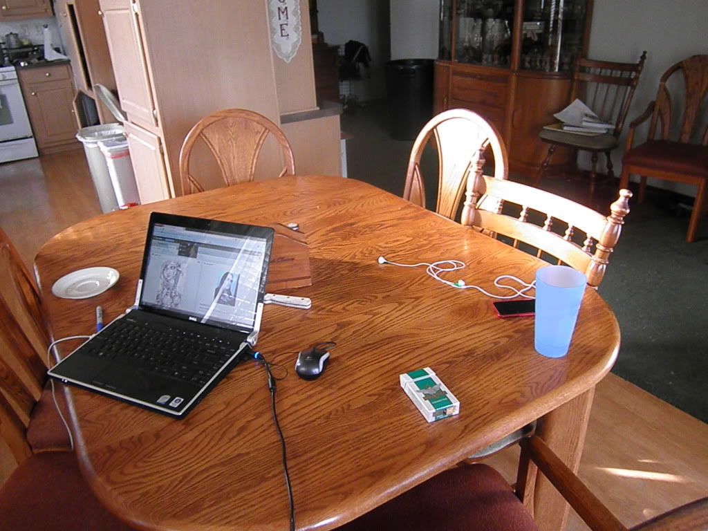
Leilani WIP. I'm not sure if I like it yet. I think I need to go back and add some more highlights to Lelani herself so that she stands out from the background some more which also needs some tweaking. Is the image too dark altogether? Its hard to tell on my monitor

Thursday, April 21, 2011

Shiloh Scott

New Character. Your typical Emo, but he's cute. I think so at least so I thought I'd share. Nothing serious.

Monday, March 28, 2011

Sketchbook 1

This is just a page out of my sketchbook. I didn't feel like adding it to my deviantART but I didn't want it just to sit unviewed by everyone either so I compromised and put it here.
It started out as a random character but actually started to look like I slapped two of my OCs, Meglein and Mariah, together. I still like it though, despite being a pretty boring picture. It was a good waste of time to kill an hour methinks.

Sunday, February 20, 2011

First Post

This is officially under construction as of now. First the layout, then the content, if that makes any sense at all =]