Tuesday, December 13, 2011
Photography Project 2: The Refridgerator
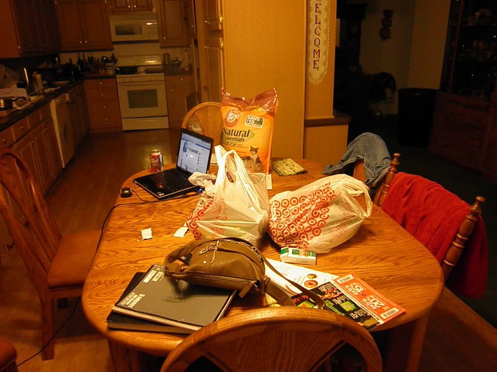
This project is more inspired by my own weird and random curiosity. I was wondering how often things in a refrigerator got moved around because it seems like I can never find anything. So in addition to photographing the dining room table I took a little detour to the fridge as well.
Monday, December 12, 2011
Photography Project: The kitchen table
Photography Project:
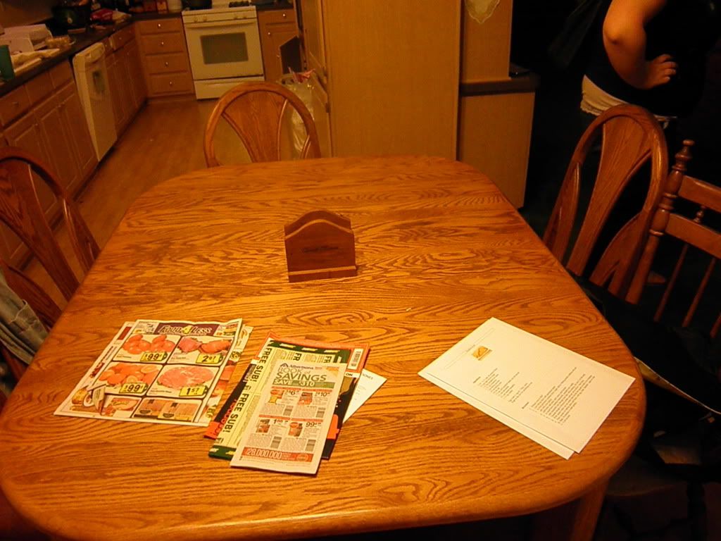
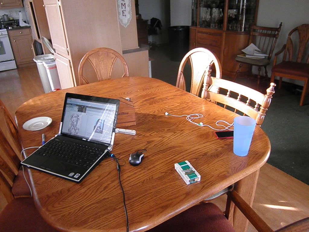
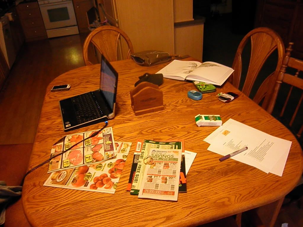
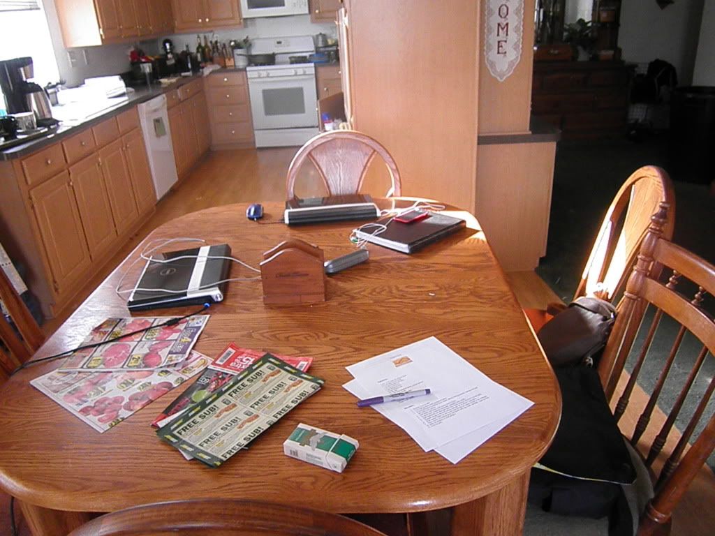
What is the dining room table? In the past, I would argue that it symbolized a place for people, particularly families, to come together, where neighbors sit when you invite them over, where delicious food lies when you're hungry.
Unfortunately, in more modern times I believe this is a false connotation. I have taken a picture of my very own dining room table several days in a row, trying to find evidence of people coming together.
There are five people (including myself) in the household yet do the photographs show anyone?
I came home to catch the evil feline on the table but he jumped off before I could catch the evidence on film.
Tuesday, November 29, 2011
What is Beauty?
Similar to one of the first questions we were asked, "What is Art?", beauty is something that cannot be defined by one simple definition. Different people choose to see different aspects as different things. I would like to say "beauty is in the eye of the beholder" but only because we were begged not to. In truth, its both very similar and very different to this.
In truth, beauty exists on different levels, many of which contradict each other. In example There is Physical beauty, emotional beauty, Inner beauty (people), there is beauty in a story or concept, and beauty in the way a well told lie or deception is thought out, and beauty in music.
Using these layers it is easy to imagine something that is both beautiful and hideous, like a painting with beautiful composition and painted perfectly but has a gruesome subject matter, or the reverse, a painting that, visually isn't as "pretty" But has a deep, beautiful meaning or emotional pull.
I personally, like the vain individual I am, find myself focusing most on physical beauty, how colors and shapes appeal to the eye and overall balance. I can appreciate beauty elsewhere but it is not what jumps out at me first.
That being said, I find beauty (particularly in art) in the intricate details and textures. I believe it is because of this that I tend to dislike bright colors more as it distracts my eyes from the intricacy that I so love.
Monday, November 28, 2011
Artist Presentation: Inka Essenhigh
Inka Essenhigh was born in Bellfonte Pennsylvania. She had attended both Columbus College of Art & Design and the School of Visual Arts in New York City.
Inka Essenhigh's chosen medium is oils paints, which she says, is because it has more variety and that she, personally, associates it with deeper emotions. Born Again
2000
oil on canvas
90 x 78 inches
Essenhigh is attracted to "moody" and "muddy colors". She also says that she likes twilight. While she "might decide to paint daylight" She prefers a "moodier Palette"
White Rain
2001
oil on enamel on canvas
72 x 74 inches
optimistic horse and rider
2002
oil on panel
74 x 70 inches
getting comfy
2002
oil on panel
56 x 54 inches
Although I could not find much about her personally, while going through her website and gallery I noticed that her older work was mostly flat colors with the same distorted figures that her work features nowadays. It was not until 2002 that her paintings began to appear more three-demensional.
green wave
2002
oil on panel
60 x 72 inches
fantasy
2003
oil on linen
70 x 74 inches
chainlink fence
2004
oil on canvas
76 x 70 inches
The majority of Essenhigh's paintings are a narrative with a distorted, twisted figure taking part in a story which is usually drived from a particular "atmosphere of encounter", Perception, individual or scene.
brush with death
2004
oil on linen
60 x 48 inches
In Bed
2005
oil on canvas
68 x 62 inches
This is the painting that was featured in the text book that inspired me to choose Inka Essenhigh for my presentation. I loved how twisted and dream-like it was, especially with how the sprites are tugging at the sleeping woman.
Setting Sun
2005
oil on canvas
75 1/2 x 70 inches
Subway
2005
oil on canvas
78 x 70 inches
Exhibited at the Saatchi Gallery. "Subway" Depicts subway commuters at rush hour bustling to their lives leaving behind fluid trails of themselves.
Dance Party
2006
oil on linen
46 x 42 inches
Fall (Red)
2007
oil on canvas
Global Warming Cloud
2008
oil on canvas
78 x 60 inches
Spring Bar Scene
2008
oil on canvas
78 x 72 inches
Sleeping Faun
2010
Tuesday, November 1, 2011
Chapter Twenty-Two: Artist Contrast 2
The gold color and various shapes found in Louise Nevelson’s “Royal Tide II” are phenomenal. What is more amazing is how Nevelson could take ordinary materials and objects and in turn create a piece that fits so well together that those objects become unrecognizable unless looked and studied closely. Furthermore the choice to paint the whole thing gold was a wise choice as it further meshes the sculpture together and creates a sort of unity amongst the otherwise odd and abstract shapes. This makes the sculpture look rich, coherent, and elegant.
In contrast to this, Renzo Piano and Richard Rogers building The Georges Pompidou National Center of Art and Culture in Paris, is multiple colors. Its bright, vibrant, and young despite being built in 1977. Very much like Nevelson’s Sculpture, there’s a lot of details that mesh together beneath the glow of the bright lights. The scaffolding on the outside reminds me of the borders around Nevelson’s sculpture. What I enjoy most about this building though is the pathway leading up to the multiple stories of the building. It looks like it would be incredibly fun to walk through much as “Royal Tide II” looks like it’d be incredibly fun to see and touch to attempt to identify everything put into it.
As far as differences go, the two have many. First there’s the obvious fact that one is a wall-like sculpture while the other is a large-scale building. One is monochromatic in a rich gold while the Pompidou National Center of Art and Culture is bright with a multitude of colors, lights, lines, an windows. If I had to describe each, I would say that Louise Nevelson’s “Royal Tide II” is a contrast between abstract but still, to me, has an old fashioned feel. However Renzo Piano’s and Richard Rogers’ building is bold, new, and futuristic.
Chapter Twenty-Two: Artist Contrast 1
Alice Neel was a painter that did not what people expected but rather what she wanted. On page 510, Neel defines herself not as a “portrait painter” But as a “people painter.” I agree with this statement. The term “portrait” sounds stiff, perfect, and posed. Alice Neel’s paintings are anything but these. They are loose, expressive, and allows you to see not a perfect rendering of the persons literal appearance but a glimpse into their minds, emotions, and expressions.
As already stated, Neel’s paintings are expressive. They She seems to focus on feelings, personalities, and individuals as opposed to painting a mere physical shell of a person. It is just as Neel says. She paints “people” not just bodies, not just portraits.
The particular painting of hers that caught my attention is “Harley” that she had completed in 1965. What I enjoy most about this painting is the pose. It is something I have seen many times in life; When someone is upset, fed-up, lost, or stuck and do not know how to proceed. It is a feeling that Neel has captured phenomenally.
In comparison to this, I found that Jenny Saville’s painting “Rosetta” on page 515 which made me think of as pure expression. The blank blue eyes, the facial expression, even the style in which she painted it all. It all builds up a feeling of being lost or despair.
In addition to their use of emotion and expression, both paintings are similar in style. In both the strokes of paint are visible. They are not meticulously blended as in photorealism and because of this I believe the paintings become even more powerful than they would have been had the artist chosen to perfectly render them.
Tuesday, October 25, 2011
Chapter Eight: Artist Contrast 2
Compared to the last two artists, Ed Ruscha’s Standard Station is neither a wood cut or an engraving. it’s a screen print and as far as stylization goes it is very stylized. The simplicity of this image is beautiful. There are so few colors used yet they are used in such a way that the image itself stands out. The red Gasoline pumps which would not stand out against the sky, stand out starkly against the beige of the station. This also holds true with the “Standard” Sign, which would be missed amongst the intense orange yet seems so bright in comparison to the blue sky in which it sits.
In Comparison to Standard Station, March Chagall’s Solomon from the Bible is very different. Not only is it a lithograph instead of a screenprint but the images are made up of distinct black lines, whereas Ed Ruscha’s screen print had no lines around his chosen colors. Solomon from the Bible Also lacks that crisp transitioning between colors. Colors don’t end, instead they bleed and blend together to color the piece and without the black outlines it would be difficult to depict the image at all. However, much like Ed Ruscha’s, Chagall’s lithograph is very simple. Both pieces, regardless of colors, are flat, and the lines used in Solomon from the Bible Are used minimally and very simply very much as the colors in Standard Station were used very minimally and simply.
Although it is difficult to say which one is in essence “better” in my mind due to both pieces being so different, I will say that I much prefer the clean-cut simplicity of Ed Ruscha’s colors over the muddled hues in Marc Chagall’s work. I can see how this kind of image would be mark able and easily reproducible and overall “Likable”.
Subscribe to:
Posts (Atom)


